I have to disagree. Removing features for the sake of simplifying things for the idiot masses frustrates me like no other. To this day I’m still upset over the removal of the Menu button in Android.
Also, love to be that guy: it’s their. I’ll never understand why people mix up their, there, and they’re so easily. Same goes for you’re and your. I realize that I’m being a dick but this shit is basic elementary school English.
Thank you for correcting me. I doing these mistake more and more, I don’t know why.
I also forgot the negation in my message but that’s a new level of mistake here!
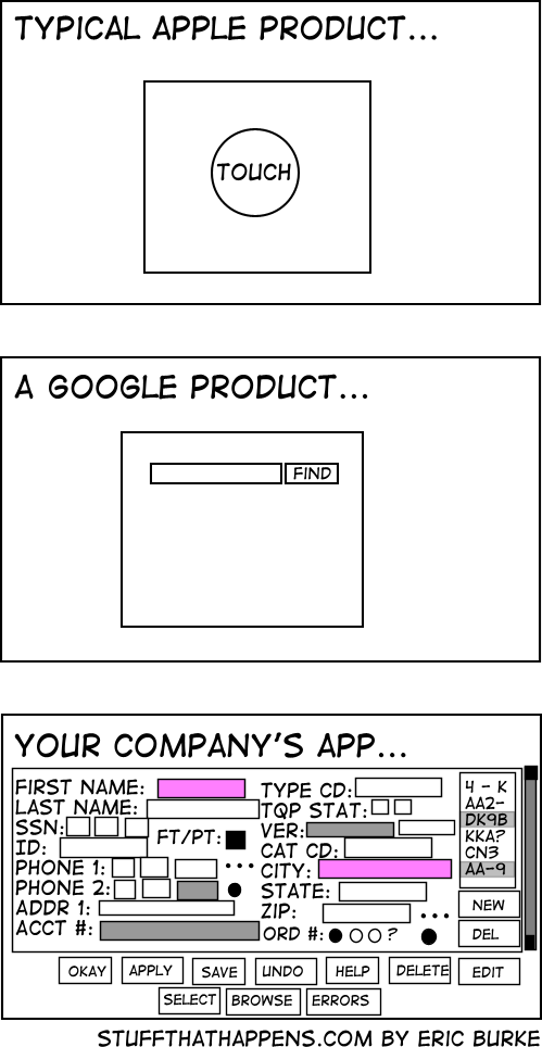
I think there is balance to have between founding where to click easily and allowing complexity in your functionality. To many UI mix together multiple functionalities making it hard to do one simple thing. For Google, it’s the opposite there is so little option on one screen that having a overview of what your doing is complicated : you feel lost when you try to do something new and you lost track of what you did when you try to do something complicated.


I mean, so many company overload there screens with button. I can understand why Apple and Google keep doing there thing.
I have to disagree. Removing features for the sake of simplifying things for the idiot masses frustrates me like no other. To this day I’m still upset over the removal of the Menu button in Android.
Also, love to be that guy: it’s their. I’ll never understand why people mix up their, there, and they’re so easily. Same goes for you’re and your. I realize that I’m being a dick but this shit is basic elementary school English.
Thank you for correcting me. I doing these mistake more and more, I don’t know why.
I also forgot the negation in my message but that’s a new level of mistake here!
I think there is balance to have between founding where to click easily and allowing complexity in your functionality. To many UI mix together multiple functionalities making it hard to do one simple thing. For Google, it’s the opposite there is so little option on one screen that having a overview of what your doing is complicated : you feel lost when you try to do something new and you lost track of what you did when you try to do something complicated.
deleted by creator