
8·
5 months agoIssue is that Immutable also conveyed a different type of information. When I first heard of it, I genuinely thought it was something like DeepFreeze for Windows
Issue is that Immutable also conveyed a different type of information. When I first heard of it, I genuinely thought it was something like DeepFreeze for Windows

Yeah, I’m thinking about doing some really weird shit by sharing the steam folder between users and then mounting compatdata inside each /home so that save files from proton games are individualized.
Sadly this requires a more traditional distro instead of ChimeraOS or HoloISO, which I didn’t really want, but it offers more possibilities later down the line
The issue is that AFAIK there is no way to get an event when the Steam user is swapped
It depends on the game. If the game uses Valve’s recommended file path there’s no problem. If the game uses Steam Cloud it will sync your save file with what it should have.
Those distros are basically focused on offering a console like experience on Linux, as in, a machine that is hooked to a TV, has no keyboard or mouse and only method of input is a gaming controller. They all start directly into Steam Big Picture mode, and there’s a single system user, all users are Steam Users. This works, but has the issues with save files I’m trying to get a solution that hopefully doesn’t involve changing to a traditional distro
Afaik it isn’t an option in SteamOS/HoloISO/ChimeraOS and would require a more “traditional” distro to be used, which does fixes those issues, but now we have other issues, like how those distros aren’t made to be used as consoles, and there’s the issue with Steam Family Sharing (as I understand, you need to be logged with the Steam Account in each system user you wish to share the library with)
Btrfs is really cool, just a warning: I had a surprise when I found out the subvolumes make a device more of a hassle to mount externally, you can’t just put it on an external HDD enclosure and expect it to work as painlessly as it is with more “traditional” file systems, I had to mount each subvolume manually as GUI file managers only mounted the root.
It’s not complicated, but more than I’d hoped for.
I don’t really understand that argument, and I want someone to correct me:
If you were keeping your battery at the ideal charge (i.e. 20% to 80%) that means you are really only using 60% of your battery during its lifetime. I’ve been using my phone since July of 2021, always changing it to 100%, preferably only charging when it gets close to 0%. Using AccuBattery I get the battery stats and after 2 years and a half, the battery capacity is at 85%.
I still have 85% of usable battery, this is more than the 60% I’d get if I was using the battery ideally. So I don’t really get this argument about taking care of the battery cause it appears it would take a while before the battery is degraded enough to hold less charge than the recommended rate.
Some apps have useful information that you can glance using the notification, like Tasker or those Battery monitoring apps. Dismissing those notifications is a pain in the ass for users that use them

A family member always downloaded and installed APKs from the internet and didn’t know about the Play Store cause that is how you did things on Windows.
The person is question has low tech literacy, and they were doing this for years
As if ‘working’ in black and white means there’s any benefit to being in black and white.
There are bunch of benefits to that, just look at the popularity of monochrome icon packs. Even before the official introduction of Adaptive Icons on Android 12, the status bar was already using monochrome icons to increase visibility. Notification icons were monochrome since a while ago.
When the UI itself works without hue, you are pretty much guaranteed that color blind users aren’t left behind, how’s that not a benefit?
Whilst complaining about a logo that’s already basically white-on-blue. And is plainly a compass even to me
I mentioned they eventually increased the most defining features of the icon after a Redesign, as the cardinal directions letters were removed to make the needle and the… degrees(?) more visible.
How do you encourage that, right after complaining that part of the Safari icon is only as distinct from its background as the entirety of any Material You icon?
I’m frankly unsure how the hell would you get a Material You icon (actually Adaptive Icon) to have the same low contrast as the safari icon. IIRC it is using primary and on-primary color tokens.
again, they look fine.
Agree to disagree.
And doing ANYTHING for the sake of 320x480 in 2023 is just fucking insane! Have we addressed that, directly? The fact we’re even talking about how this style looks at original 2007 iPhone resolutions, while discussing enormous high-def pentile OLED pocket supercomputers, makes no god-damn sense. ‘It wouldn’t work as well as it did on the the displays it originally worked on’ is a complete non-sequitur, even if it wasn’t self-contradictory,
Why the hell are we still talking about this?!
Actually, the newly released Pixel Tablet has a closer than you think density to the first iPhone. IIRC each dp on the Pixel Tablet is less than 1.75 pixels. It isn’t even double than the first iPhone.
It makes translation more of a headache than it needs to be.
iirc
sudohas a bunch of quotes to spit out when an incorrect password is typed. Gentoo exposes that feature with theoffensiveUSE flag.
Argh, why tho?
Like, I get that it is sometimes fun to throw some humor and things like that, but it is just too much trouble. It looks unprofessional and makes translation more of a pain than it needs to be. And that isn’t even opening the can of worms that insults actually are
Edit: alright, I got it. L for me
You are misunderstanding the situation. The safari logo is a mess, we know what it means because we’ve seen the big res version. For a designer, this means that color can get in the way when pixels are limited and it makes then aware that too much detail can result in a visual mess, the solution is to create a logo that can work in monochrome and to make the necessary parts of the logo more prominent.
The safari logo removed the letters and focused on the compass metaphor. On Android, notification icons are monochrome, so this implies the app logo should also work in monochrome. What this all means is that a Designer is more likely to start with a monochrome and low detail logo icon and then start adding details if necessary, because removing detail is more difficult than adding.
I don’t think the picture you sent of Android 12 is actually from Android 12, at least I think it is from Samsung due to the icon colors, not AOSP. I really hate Samsung’s implementation of Material Design so I will not defend them, because it really sucks.
I was pointing out that even in the old iPhone, the actual division of items were made with colors and outlines, not with gradients, which are not great to actually create UIs
This is purely speculation on my part after using Material Design 3 for an App Redesign, but I think the actual Material You system probably started as a way to help developers get a color palette. Material Design 1 and 2 required the devs to actually code the colors(or get the palette from a website) and sometimes this resulted in weird combinations, Google simplified the process so devs can just add 3/4 colors and it is harmonized.
At some point they figured out it would be useful to have the seed be a dynamic image, like the new media stream controls on the quick settings which use the colors of the album cover. If there is already a tool go generate a palette from a picture, adding a way to generate the palette from the user wallpaper is a nice bonus.
Tl;dr: I think Material You is a bonus from the development and streamlining of Material Design color palette. As well as a greater understanding that designing with saturation is better than with colors due to the existence of color blind people.
The only colors that have a contrast issue in Material Design 3 is actually the surface container colors, but they are not meant to be used together without another means of separation, so it is fine
It doesn’t stop working per se, but it starts looking… weird.
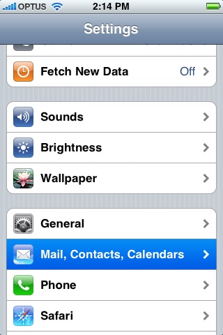
Take for instance this screenshot, I believe it is from an iPhone 1st gen, but I’ve never seen an iPhone so who knows.
You can see how the battery icon gradient is kinda weird close to the outlines.
The bottom area of the axis of the General icon is almost bleeding with the background
How the top of the Sounds, Brightness, Wallpaper and iPhone is starting to blend with the highlight.
And the Safari icon is a blurry mess.
Even here, you can see that the actual list items lack any sort of skeuomorphic design, being separated by an outline to improve visibility. Heck, even the status bar and the top app bar uses outlines to separate them from the main view, foregoing drop shadows.
Exactly. A 4k screen will have the same amount of DP as a 480p screen if both have the exact same size. Elements will appear smoother and more defined, like letters, on the 4k screen than they would on the 480p one, because the 4k display has more pixels per DP, but the actual number of DPs on screen will be the same.
Like, imagine you have a 1080p phone and a 4k Tablet that physically could fit 4 of those phone screens. The Tablet would have two times the amount of vertical and horizontal DPs than the phone, but each DP would correspond to the exact same amount of pixels, and the buttons would have the same real world size.
Oh wow, so a one-DP drop shadow scaled to 4K would be six whole pixels.
If, and only if, the screen size was the same. And even then it would be 10 pixels.
Gradients can scale, but if you are trying to use a big fancy gradient effect and the actual pixel size is, like, 1 pixel, then you lose all those effects and it looks weird. You can kinda see something similar with Apps icons losing visible detail and looking weird if they are too detailed.
IIRC Android actually has the minimum width/height of 360 DP, which is basically 360 pixels (or it was 320?)
Mostly variable screen size and resolution.
Google created a system called DP (not DPI, or PPI), or density-independent pixels.
To keep it very short: The gist is that bigger resolution on the same screen size just allows better clarity, but doesn’t change the size of elements in relation to the physical world. So a button would have the same real-world size on a 720p device or a 1080p one (assuming the screen size is the same), which is desired because with phones, the screen is the thing you use to control the device. App devs use DPs as the target, not a resolution itself, the system can handle how things are actually displayed.
This is fine for an interface that uses color as the way to differentiate elements, but it gets really weird when you use something less flat. Like, imagine you are using gradient and shadows to separate UI elements from each other, but you want it to have the same real world size, like Android. On some devices, the actual pixel size of the gradient can be too small to actually render properly so it looks blocky, or the pixel size is too large, and it looks weirdly over smooth.
I have a bunch of issues(some way smaller and borderline nitpicks) with windows, but I guess there’s some big ones:
Linux runs smoothly on older computers, even with KDE which everyone talks about as if it was heavy. Windows is a slug in comparison.
Linux is free, truly free. Microsoft can’t beat that.
Shit just works (unless you are on Nvidia…), don’t need to install drivers and shit like that.
most of the software you don’t get from a random website and they all update at once, rather than having each one update itself and only itself