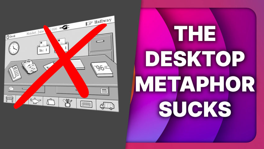
If you think about productivity, you can’t help but think that having the default state of your computer being an image with a few icons on it is less than stellar. For opening files, it will never be tidy enough to give you access to all you need, you need a launcher or a folder structure, meaning the desktop is bad at this. For opening apps, having visual shortcuts on the desktop is a duplicate of whatever panel or launcher you have.


Kind of surprised this is getting so much criticism. It’s a thought experiment, not a call for a fundamental change to all PC UX. My only real argument against the idea is that it’s framed as being “for efficiency”. If you want efficiency above all else you would just go full command line.
There are valid criticisms, but I do think it’s good thought experiment. COSMIC desktop came out, but it’s not doing anything radically new besides writing it in Rust. I haven’t seen a completely new approach for OS interfaces yet but hopefully videos like this can get a conversation started on alternatives.
Anti Commercial-AI license