The lag in funding extends far beyond D.E.I. initiatives, affecting almost every area of science: chemistry, computing, engineering, materials and more.
True, the bar chart is probably the best, but both pie and bar outperform, by a wide margin, whatever NYT’s chart is. With this many categories, I feel a pie chart will handle this info better than a bar chart.
From a pure functional perspective, probably. Maybe.
Personally, I look at this more as a piece of art, as the chart was most likely picked because the visuals replicate what its describing: Science funding was shattered and is now in pieces.
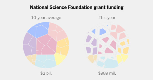
NYT, wtf is this shite infographic? Just use pie charts, they’re so much simpler to parse.
Pie charts suck too.
True, the bar chart is probably the best, but both pie and bar outperform, by a wide margin, whatever NYT’s chart is. With this many categories, I feel a pie chart will handle this info better than a bar chart.
From a pure functional perspective, probably. Maybe.
Personally, I look at this more as a piece of art, as the chart was most likely picked because the visuals replicate what its describing: Science funding was shattered and is now in pieces.