
NASA is also looking at massive science cuts.
American Brain drain loading…
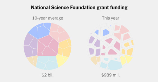
I bet the small blue one, on the buttom, witch does not gets smaler, is Elons SpaceX funding.
You don’t have to bet. You can click on it and find out.

Ahhh, i didnt klick on it. thak you. Intresting, it seams very random, i wonder why they increasd the spending on Ocean sciences?

Because there’s money to be made and they’re arseholes.
I think it’s a little bit humorous that republicans think we’ll actually get some of that money via no taxes at all or stimulus checks lmao.
They don’t think that, but they think it’s humorous that you still believe that.
The politicians, anyway. The voters are probably still fooled.
Kakistocracy at its finest.
Does that chart account for partial cuts that destroy ongoing studies? The kind that would have to be completely scrapped because one element is lost. Even worse, if all replication or even repetition were cut, then we are throwing out all of science.
I hope Europe is able to step up like they were talking a couple weeks ago.
Sure, Not

Kind of embarrassing don’t you think. For a country to fall so far :/
NYT, wtf is this shite infographic? Just use pie charts, they’re so much simpler to parse.
Pie charts suck too.
True, the bar chart is probably the best, but both pie and bar outperform, by a wide margin, whatever NYT’s chart is. With this many categories, I feel a pie chart will handle this info better than a bar chart.
From a pure functional perspective, probably. Maybe.
Personally, I look at this more as a piece of art, as the chart was most likely picked because the visuals replicate what its describing: Science funding was shattered and is now in pieces.